5 Polynomial Regression
Polynomial regression is an extension of linear regression that fits a curve to capture more complex patterns in the data. In practice we still use a linear model in the coefficients, but we model the response as a polynomial function of the predictor.
In polynomial regression the model takes the form:
\[ y = \beta_0 + \beta_1 x + \beta_2 x^2 + \dots + \beta_k x^k + e \]
where - \(y\) is the dependent variable, - \(x\) is the independent variable, - \(\beta_0, \beta_1, \dots, \beta_k\) are coefficients, - \(e\) is the error term.
5.1 Motivation
Polynomial regression is useful when the data exhibits a nonlinear trend that cannot be well approximated by a straight line. By increasing the degree of the polynomial, the model can fit more complex patterns, though caution is needed to avoid overfitting.
There are two main scenarios for using polynomial regression:
The underlying process is inherently polynomial. A polynomial provides a good approximation for the relationship. If you know that the phenomenon you’re modeling follows a polynomial function, there’s no need to worry about overfitting. You can confidently use the polynomial degree that best fits the known relationship.
5.1.1 Taylor polynomials and polynomial regression
A natural motivation for polynomial regression comes from the idea of Taylor polynomials. A smooth function \(f(x)\) can be approximated locally (near a point \(x_0\)) by a polynomial whose coefficients are derivatives of \(f\) at \(x_0\). The Taylor polynomial of degree \(k\) around \(x_0\) provides a polynomial that approximates \(f(x)\) well in a neighborhood of \(x_0\).
Translating this idea to regression: - We often do not know the true function \(f\) relating \(x\) to \(y\), but we can approximate it locally by a polynomial. - Fitting a polynomial regression model is therefore analogous to estimating the coefficients of a Taylor polynomial that approximates the unknown regression function in the region of the data. - Because Taylor approximations are local, the choice of the expansion point matters: the polynomial is most accurate near that point and less accurate far away. Overfitting can become a significant issue, particularly outside the range of the data used for model fitting, where predictions can be unreliable.
5.2 Why use the sample mean as the expansion (center) point?
Since Taylor approximations are local, it is natural to choose an expansion point near the bulk of the observed \(x\) values. The sample mean \(\bar{x}\) is a canonical choice for several reasons:
Local accuracy where data concentrate.
The polynomial approximation is most accurate near the expansion point. Choosing \(x_0 = \bar{x}\) places that point at the center of the observed predictor distribution, so the approximation tends to be good across the typical range of the data rather than skewed toward the extremes.Interpretability of the intercept.
When we center \(x\) at \(\bar{x}\), the intercept \(\beta_0\) becomes the model’s predicted value at the average predictor: it is an estimate of the mean response at the typical \(x\). This often yields a more meaningful intercept than the value at \(x=0\) (which may be outside the data range).Numerical stability and reduced multicollinearity.
Polynomial terms of raw \(x\) are often highly correlated (e.g., \(x\) and \(x^2\)), which inflates condition numbers and makes estimation numerically unstable. Centering (subtracting \(\bar{x}\)) reduces the correlation between powers of the predictor and typically produces a design matrix with much better numerical properties.Smaller average approximation error.
If you think of approximation error averaged over the empirical distribution of \(x\), centering at the mean tends to minimize the average distance between \(x\) and the expansion point; this makes the Taylor approximation, on average, closer to the true function on the observed data.
5.2.1 Examples
We use our Burger Data set, to see an example of using polynomial regression
to approximate a non-linear relationship. We will use a second degree polynomial
to fit the data.
dat <- read.csv("Burger Data.csv")

# Polynomial Regression Fit
outRegPol <- lm(Burgers ~ Price + I(Price^2), data = dat)

# Data Limits
xmin <- min(dat$Price)
xmax <- max(dat$Price)
ymin <- min(dat$Burgers)
ymax <- max(dat$Burgers)

# Scatter plot
plot(x = dat$Price,
     y = dat$Burgers,
     ylim = c(ymin, ymax),
     xlim = c(xmin, xmax),
     xlab = "Price ($)",
     ylab = "Burgers Sold")
par(new = TRUE)
# Plots real non-linear relationship
curve(expr = 100 - 30 * log(x),
      from = xmin,
      to   = xmax,
      ylim = c(ymin, ymax),
      xlim = c(xmin, xmax),
      xlab = "",
      ylab = "",
      col  = 'red',
      lwd  = 2)
par(new = TRUE)
# Plots approximated polynomial relationship
curve(expr = outRegPol$coefficients[1] + outRegPol$coefficients[2] * x + outRegPol$coefficients[3] * x^2,
      from = xmin,
      to   = xmax,
      ylim = c(ymin, ymax),
      xlim = c(xmin, xmax),
      xlab = "",
      ylab = "",
      col  = 'blue',
      lwd  = 2)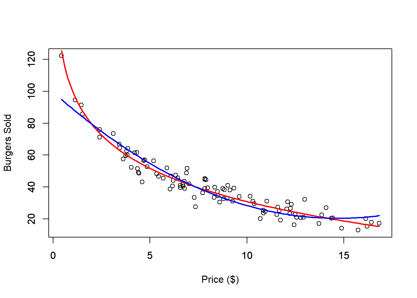
The second-degree polynomial approximation provides a reasonably good fit to the data. The red line represents the true nonlinear relationship, while the blue line shows the polynomial approximation. However, if we restrict the dataset to prices below $10, the fit noticeably worsens. This demonstrates a limitation of the polynomial model: while it might fit well within certain ranges, it can lead to unrealistic predictions outside those bounds. For instance, the model might predict that burger sales will eventually rise again as prices increase, which contradicts typical market expectations.
dat <- read.csv("Burger Data.csv")

x   <- dat$Price
y   <- dat$Burgers
xc  <- x - mean(x)
xc2 <- xc^2

# Check Correlation
print(paste0("Non centered correlation: ", round(cor(x, x^2), 4)))
## [1] "Non centered correlation: 0.971"## [1] "Centered correlation: 0.2083"# Polynomial Regression Fit
outRegPol <- lm(Burgers ~ Price + I(Price^2), data = dat)
# Polynomial Regression Centered Fit
outRegPolCen <- lm(y ~ xc + xc2)
# Data Limits
xmin <- min(dat$Price)
xmax <- max(dat$Price)
ymin <- min(dat$Burgers)
ymax <- max(dat$Burgers)
# Scatter plot
plot(x = dat$Price,
y = dat$Burgers,
ylim = c(ymin, ymax),
xlim = c(xmin, xmax),
xlab = "Price ($)",
ylab = "Burgers Sold")
par(new = TRUE)
# Plots real non-linear relationship
curve(expr = 100 - 30 * log(x),
from = xmin,
to = xmax,
ylim = c(ymin, ymax),
xlim = c(xmin, xmax),
xlab = "",
ylab = "",
col = 'red',
lwd = 2)
par(new = TRUE)
# Plots approximated polynomial relationship
curve(expr = outRegPol$coefficients[1] + outRegPol$coefficients[2] * x + outRegPol$coefficients[3] * x^2,
from = xmin,
to = xmax,
ylim = c(ymin, ymax),
xlim = c(xmin, xmax),
xlab = "",
ylab = "",
col = 'blue',
lwd = 2)
par(new = TRUE)
# Plots approximated polynomial centered relationship
curve(expr = outRegPolCen$coefficients[1] + outRegPolCen$coefficients[2] * (x - mean(x)) + outRegPolCen$coefficients[3] * (x - mean(x))^2,
from = xmin,
to = xmax,
ylim = c(ymin, ymax),
xlim = c(xmin, xmax),
xlab = "",
ylab = "",
col = 'green',
lwd = 2)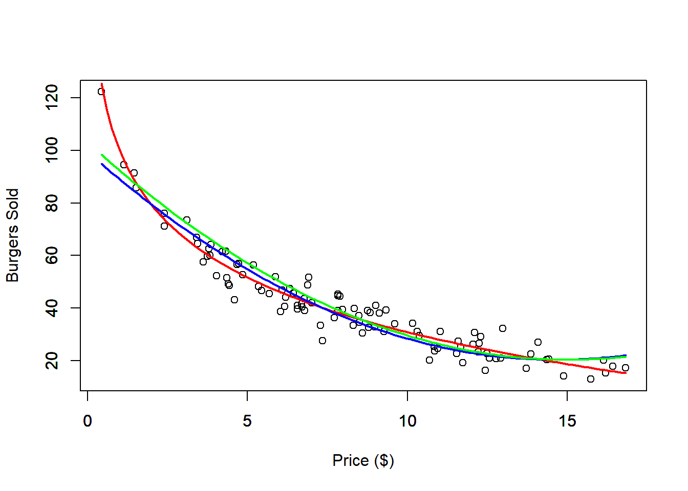
dat <- read.csv("Burger Data.csv")
# Select only Prices bellow 10 dollars
sel <- dat$Price < 10
datRes <- dat[sel, ]
# Polynomial Regression Fit
outRegPolRes <- lm(Burgers ~ Price + I(Price^2), data = datRes)
# Data Limits
xmin <- min(dat$Price)
xmax <- max(dat$Price)
ymin <- min(dat$Burgers)
ymax <- max(dat$Burgers)
# Scatter plot
plot(x = dat$Price,
y = dat$Burgers,
ylim = c(ymin, ymax),
xlim = c(xmin, xmax),
xlab = "Price ($)",
ylab = "Burgers Sold",
main = "Polynomial fit with Restricted data (Price < 10)")
par(new = TRUE)
# Plots real non-linear relationship
curve(expr = 100 - 30 * log(x),
from = xmin,
to = xmax,
ylim = c(ymin, ymax),
xlim = c(xmin, xmax),
xlab = "",
ylab = "",
col = 'red',
lwd = 2)
par(new = TRUE)
# Plots approximated polynomial relationship
curve(expr = outRegPolRes$coefficients[1] + outRegPolRes$coefficients[2] * x + outRegPolRes$coefficients[3] * x^2,
from = xmin,
to = xmax,
ylim = c(ymin, ymax),
xlim = c(xmin, xmax),
xlab = "",
ylab = "",
col = 'blue',
lwd = 2)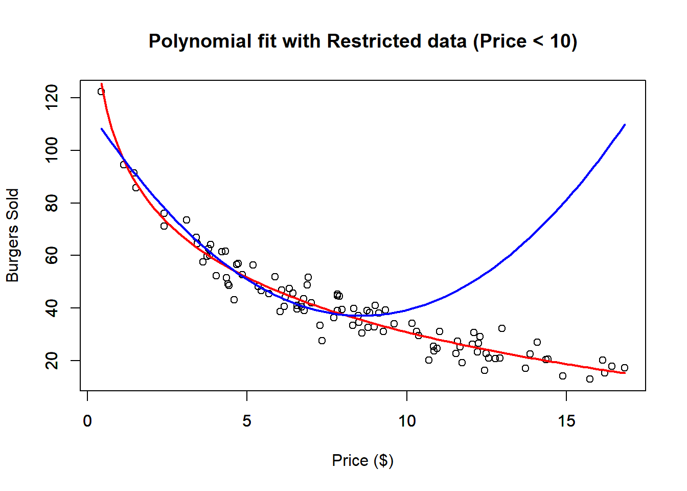 We can also check the \(R^2\) of the restricted fit.
##
## Call:
## lm(formula = Burgers ~ Price + I(Price^2), data = datRes)
##
## Residuals:
##      Min       1Q   Median       3Q      Max
## -11.0809  -3.5462  -0.0635   3.0957  13.8374
##
## Coefficients:
##             Estimate Std. Error t value Pr(>|t|)
## (Intercept) 116.0882     3.2929  35.254  < 2e-16 ***
## Price       -18.3910     1.2519 -14.691  < 2e-16 ***
## I(Price^2)    1.0709     0.1105   9.695 4.13e-14 ***
## ---
## Signif. codes:  0 '***' 0.001 '**' 0.01 '*' 0.05 '.' 0.1 ' ' 1
##
## Residual standard error: 5.062 on 63 degrees of freedom
## Multiple R-squared:  0.9131, Adjusted R-squared:  0.9104
## F-statistic: 331.2 on 2 and 63 DF,  p-value: < 2.2e-16
And notice that, the \(R^2\) with the restricted data is pretty good, however we see that outside the restricted range the fit is pretty bad.
Although polynomial regression is technically a form of multivariate linear regression—since it involves multiple polynomial terms of a single independent variable—it can still be analyzed using the tools discussed in the next chapter. Despite having multiple polynomial terms, the model has only one original independent variable that has been transformed. Consequently, the relationship between the transformed variable and the dependent variable can be effectively visualized using a scatter plot.